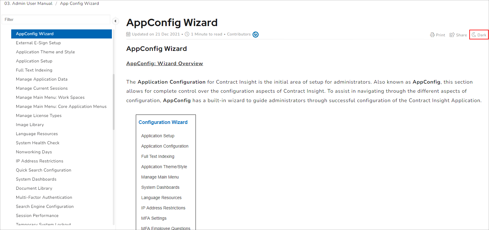
Layout of a Wiki Page
To add to it's ease of use, each and every wiki page is laid out in the same fashion. The components you find on one wiki page can be found in the same general location on any other wiki page. The following sections will go through a rundown of the components and their layout from the top down.
1. Wiki Page Overview Information:
The overview information for the wiki page you are currently viewing is located in the upper-middle of your screen, at the top of the page. 
There are three parts to this overview information, each of which helps to provide high-level insight into the currently viewed wiki page.
a. | The top piece of information is the Title of the wiki page. This is also referred to as the page name. |
b. | The bottom piece of information is the "last modified" detail, as well as the time to read (estimated) and who contributed to the page's creation. |
2. Print/Share/Brightness Buttons
All the way to the right of the screen in the same area as the wiki page title are three buttons which allow users to print the page's contents, share the page's contents, or toggle the page from light to dark and vice-versa. Shown below is an example of what "Light" mode looks like, vs. what "dark" mode looks like.

3. Feedback Options
On the bottom of each page, there are feedback options in which users can give a thumbs-up if the page was helpful to generate any form of understanding about the topic in question, or a thumbs-down if not. We pride ourselves by celebrating any kind of victories with you through a quick thumbs-up, as well as recognizing areas of improvement with a thumbs-down.
